For anyone looking to master digital photography post-processing, I always start with the three primary colors of light (RGB)—this is the cornerstone of digital editing, the fundamental basis of all color grading work, and a key to understanding the entire digital post-processing system.
Note: 'Digital post-processing' is the broad term for editing digital images; 'digital editing' refers to basic adjustments (e.g., cropping), while 'color grading' focuses specifically on adjusting color to achieve a desired look—all of these rely on RGB.
1. What Are the Three Primary Colors?
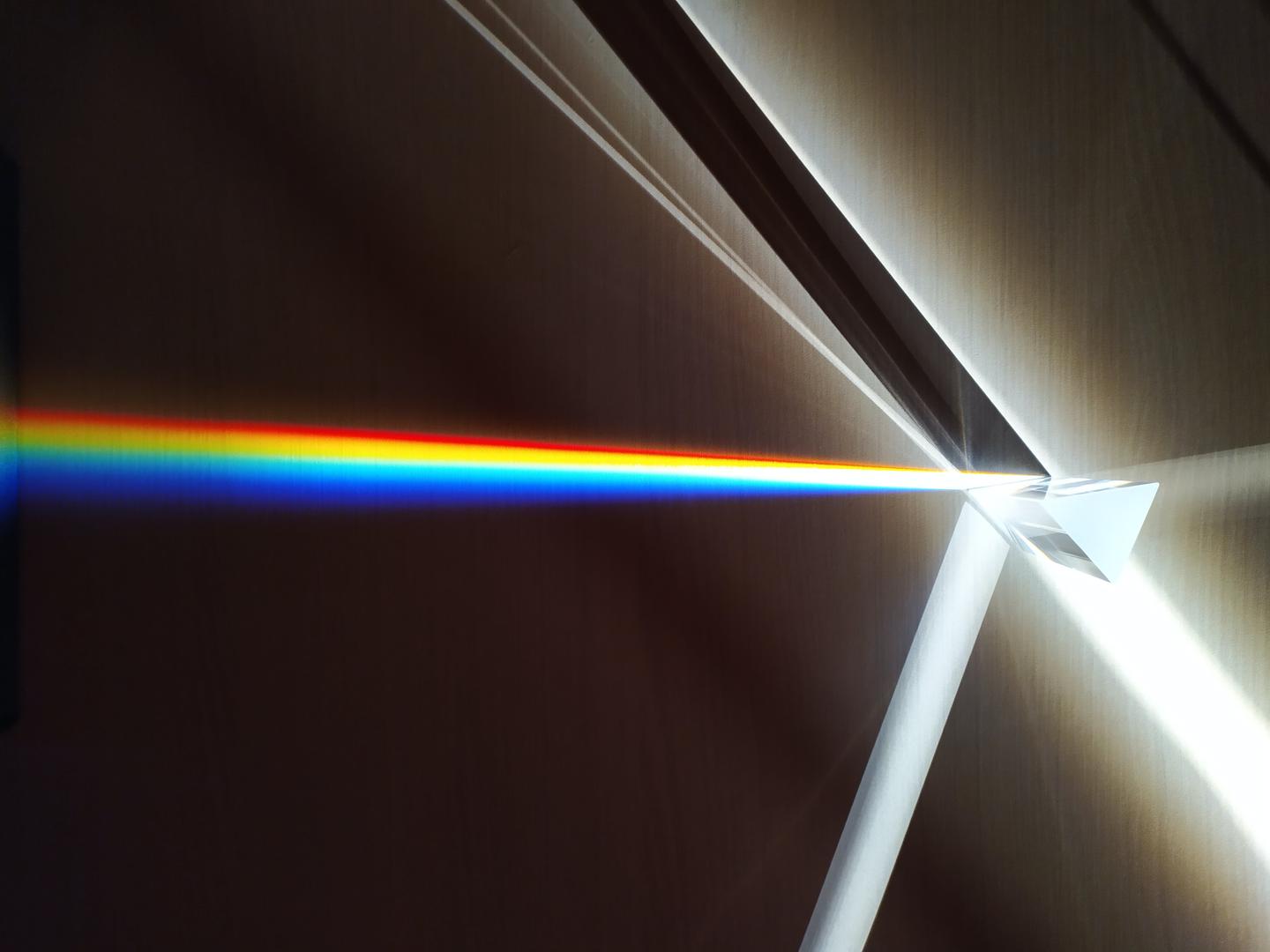
Light Decomposition and RGB

The three primary colors of light are Red, Green, and Blue. These three colors cannot be decomposed further and can be combined to create all other colors, which is why they're called "primary colors."
It's important to understand that RGB isn't an optical property of light itself, but is rather determined by the physiological characteristics of the human eye. If you're curious about why red, green, and blue are the primary colors of light, I encourage you to explore the science behind human vision. For photography purposes, we simply need to know that these three colors can be mixed to create virtually any other color.
How Your Display Actually Works

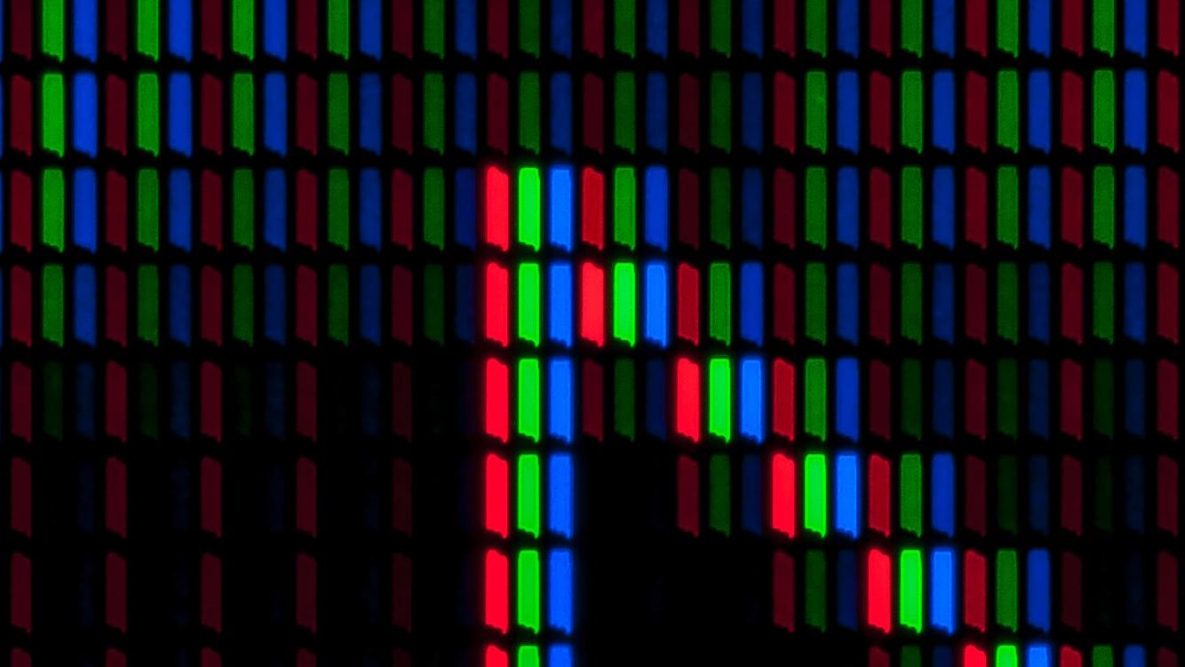
The vast majority of our displays can only show red, green, and blue colors. Every other color you see on your screen is actually a combination of these three colors. For example, the yellow you see on your phone isn't "true" yellow—it's red and green light working together to trick your eyes. The human visual system cannot distinguish between yellow light created by mixing red and green versus actual yellow monochromatic light.
Now that we've clarified what RGB (the primary colors of light) are and how displays use them, let's move to a related concept critical for color grading: complementary colors.
2. Understanding Complementary Colors

The RGB Complement System
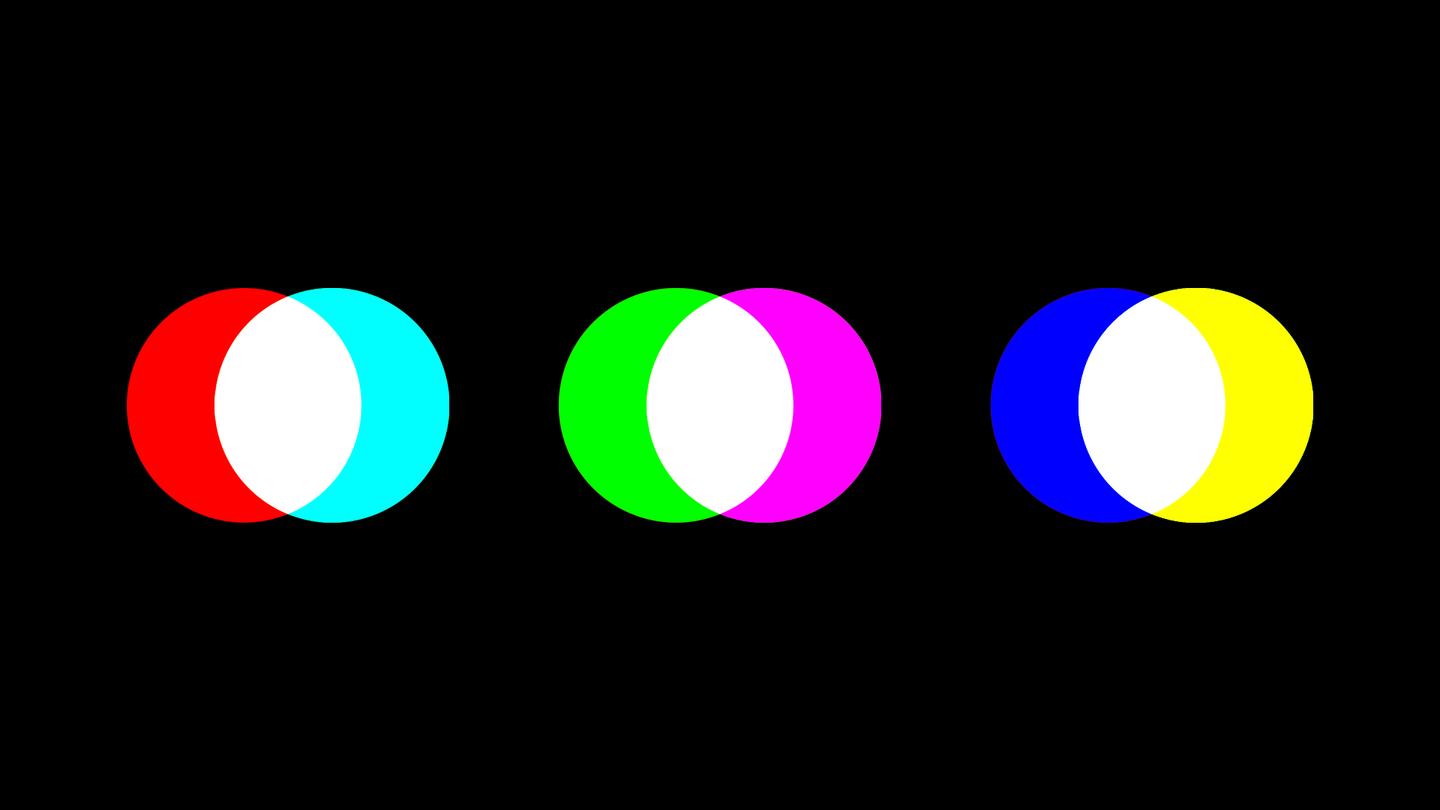
Now let's discuss the complementary colors of RGB. The complements of red, green, and blue are cyan, magenta, and yellow respectively.
Complementary colors are defined as pairs of colors that, when mixed together, produce white light. This gives us:
- Red + Cyan = White
- Green + Magenta = White
- Blue + Yellow = White
But why do complementary colors mix to create white? When complementary colors (like red and cyan) enter our eyes simultaneously, all three types of cone cells in our retina are stimulated equally, and our brain interprets this as white light.
For example, if you shine a red light and a cyan light onto the same white wall, the overlapping area will appear white—this is exactly how color correction tools work: to neutralize excess red, you can add a touch of cyan.
3. The RGB Mixing Principle

The Mathematical Beauty of Color
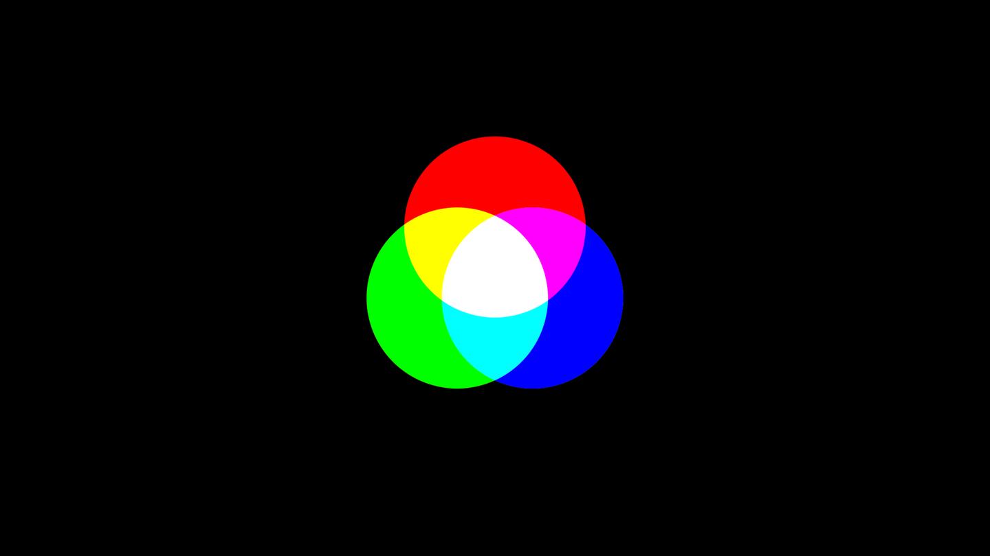
Here's the elegant principle behind RGB mixing: Any two primary colors combined will create the complement of the third primary color.
- Red + Green = Yellow (complement of blue)
- Green + Blue = Cyan (complement of red)
- Red + Blue = Magenta (complement of green)
You can test this with a simple tool: open a photo editor, create a red layer and a green layer, and set the blending mode to 'Add'—the result will be a bright yellow, just as the formula suggests.
Why This Pattern Exists
This relationship exists because equal intensities of red, green, and blue create white light, and we know that complementary color pairs also create white light. Therefore:
Red + Green + Blue = White
Yellow + Blue = White
This means: Red + Green = White - Blue = Yellow
This mathematical relationship is fundamental to understanding how digital color grading works in post-processing software.
Food for Thought
Here are some thought-provoking questions related to this article that will help deepen your understanding of these concepts. I'll address these in upcoming posts:
1. Earlier we learned that 'red + cyan = white' (complementary colors). If a photo's skin tone appears too red, what adjustment should you make to turn it neutral? Why?
2. What is the fundamental difference between white and gray colors?
3. How does the way displays show color differ fundamentally from how printed materials show color?
4. Is color an objective reality or a subjective experience?
This foundational understanding of RGB will serve as your guide through more advanced color grading techniques. Master these basics, and you'll have the knowledge to tackle any color challenge in your digital photography workflow.
Next Steps
Ready to put these RGB principles into practice? Continue your color theory journey with our next guide: White Balance Demystified - learn how to fix those pesky color casts using the RGB knowledge you just mastered!
You can also check out our Color Mixing Tool to experiment with RGB combinations hands-on!