Ever taken a photo indoors only to find that white wall looking suspiciously yellow? Or maybe your outdoor shots have an unwelcome blue tint that makes everything look cold and uninviting? Don't worry—you're not alone, and you're definitely not going crazy!
This "color misbehavior" is called a color cast, and white balance is your secret weapon to tame these color tantrums. Simply put, white balance is about making white objects look actually white in your photos, regardless of the lighting conditions when you shot them.
The RGB Balancing Act: What's Really Happening
Here's the thing: when we talk about white balance, we're really talking about getting red, green, and blue to play nice together. Remember from our RGB fundamentals—when these three primary colors show up in equal amounts, they create clean, neutral white.
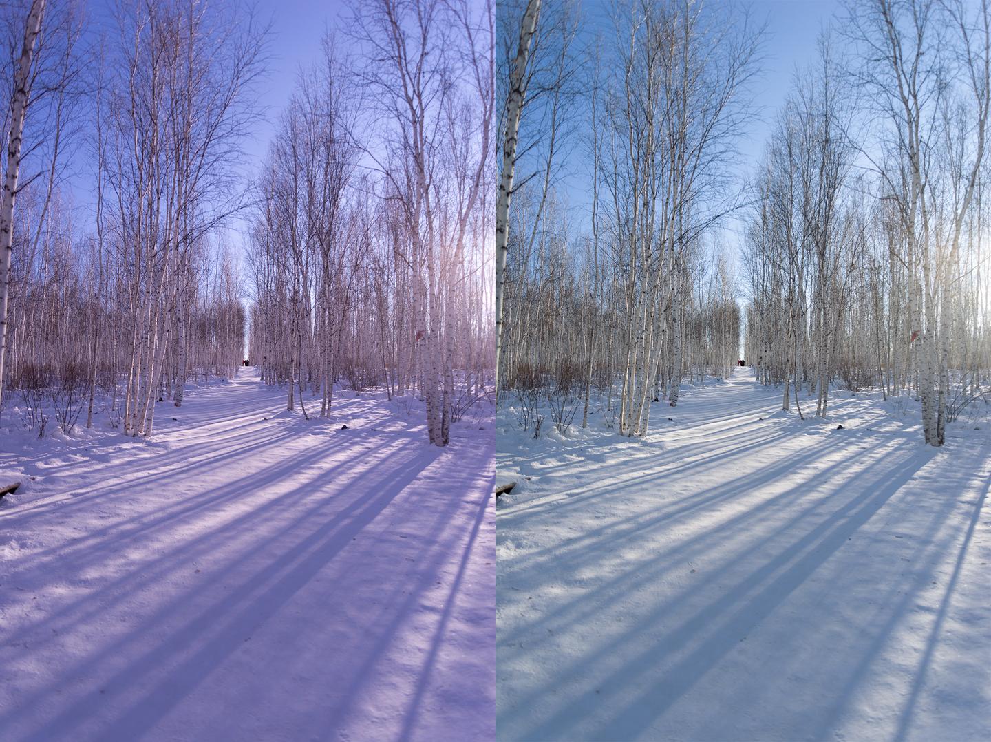
A Real-World Scenario: Fixing That Magenta Cast
Picture this: you're editing a portrait and notice the skin has an odd pinkish-purple tint (that's magenta for you). Your white balance is off, and you've got two main ways to fix it:
1. Reduce the magenta - Turn down the red and blue channels
2. Add green - Boost the green to counteract the magenta
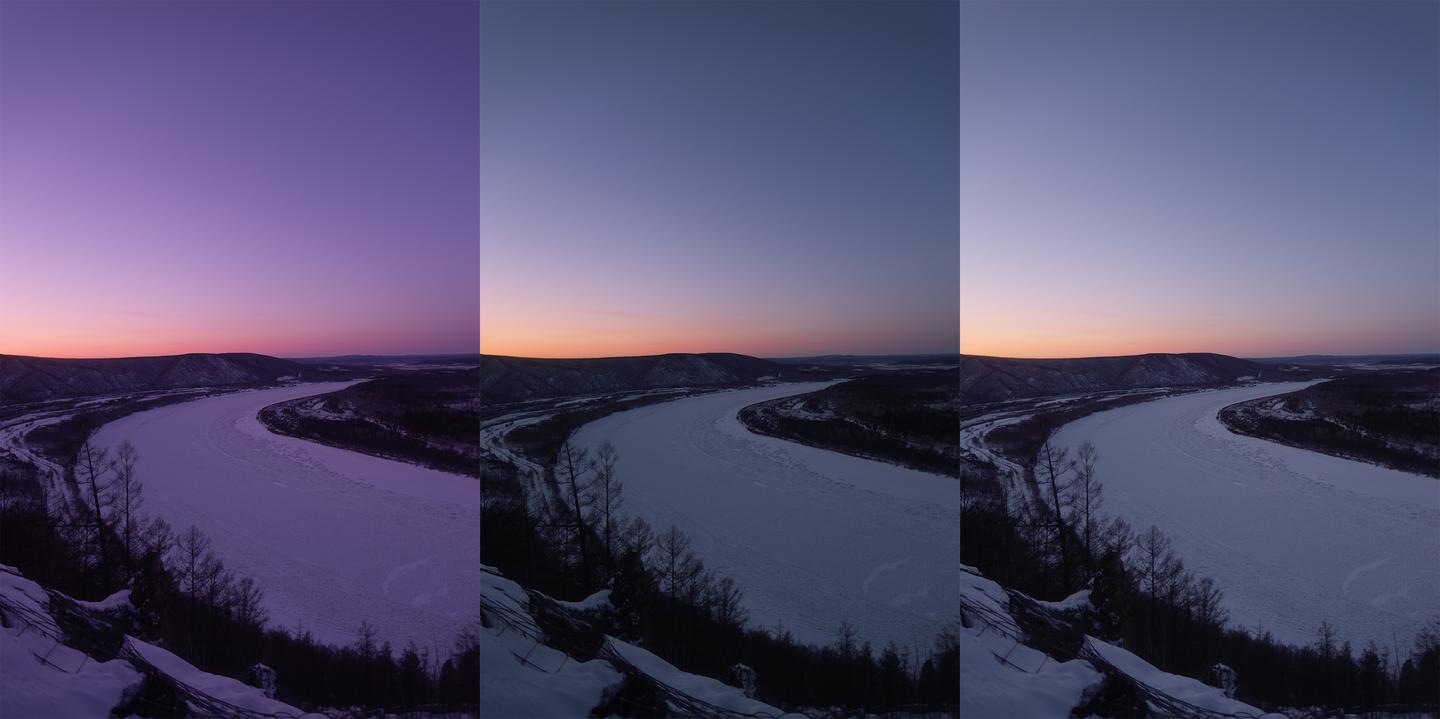
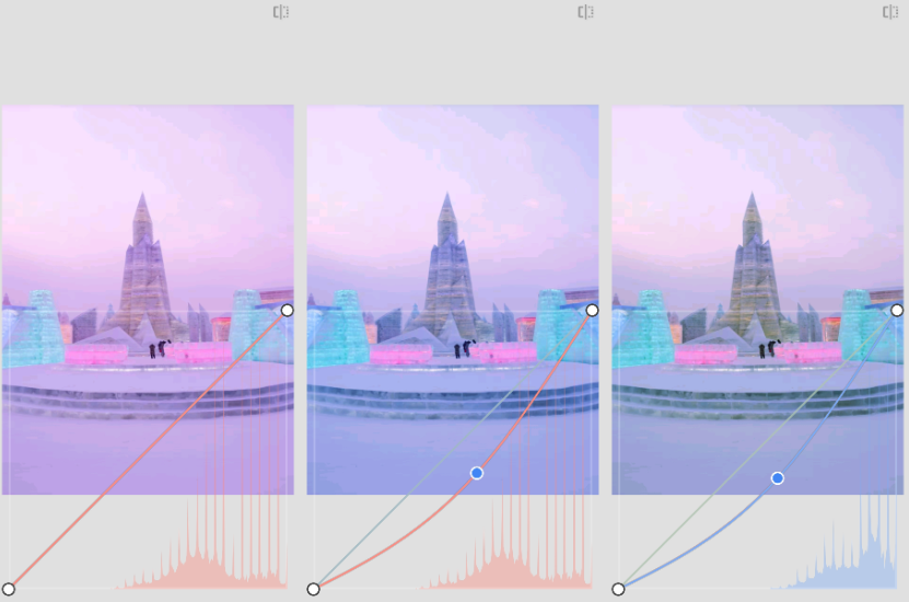
In the comparison above, you can see the dramatic difference between these two approaches. The middle image shows the result of reducing magenta, while the right image demonstrates adding green. Notice how the middle image appears noticeably darker?
Here's why this happens: when you reduce magenta, you're essentially decreasing the output of both red and blue light, which means the overall luminosity drops—making your image darker. On the flip side, when you add green while keeping red and blue levels unchanged, you're actually increasing the total light output, which makes the image brighter.
But here's what's fascinating: these two approaches give you different results beyond just brightness!
- Reducing magenta: Your image gets darker because you're decreasing overall light output
- Adding green: Your image gets brighter because you're adding more light to the mix
In my own editing workflow, I often combine both approaches depending on whether I want to maintain or adjust the overall exposure. Sometimes I'll reduce the magenta slightly and add a touch of green to get the perfect balance without dramatically changing the exposure. You'll develop your own preference as you practice!
Your Two Best Friends: Temperature and Tint
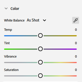
Open up Photoshop, Lightroom, or any serious photo editor, and you'll always find these two sliders: Color Temperature and Tint. Think of them as your white balance control center.
You'll notice that color temperature works with complementary colors—blue and yellow—while tint handles another pair of complementary colors—green and magenta. We frequently use both temperature and tint to adjust the white balance in our images.
Color temperature refers to the color of a black body at different temperatures. When we adjust color temperature, the image colors basically shift along the reference line shown below:
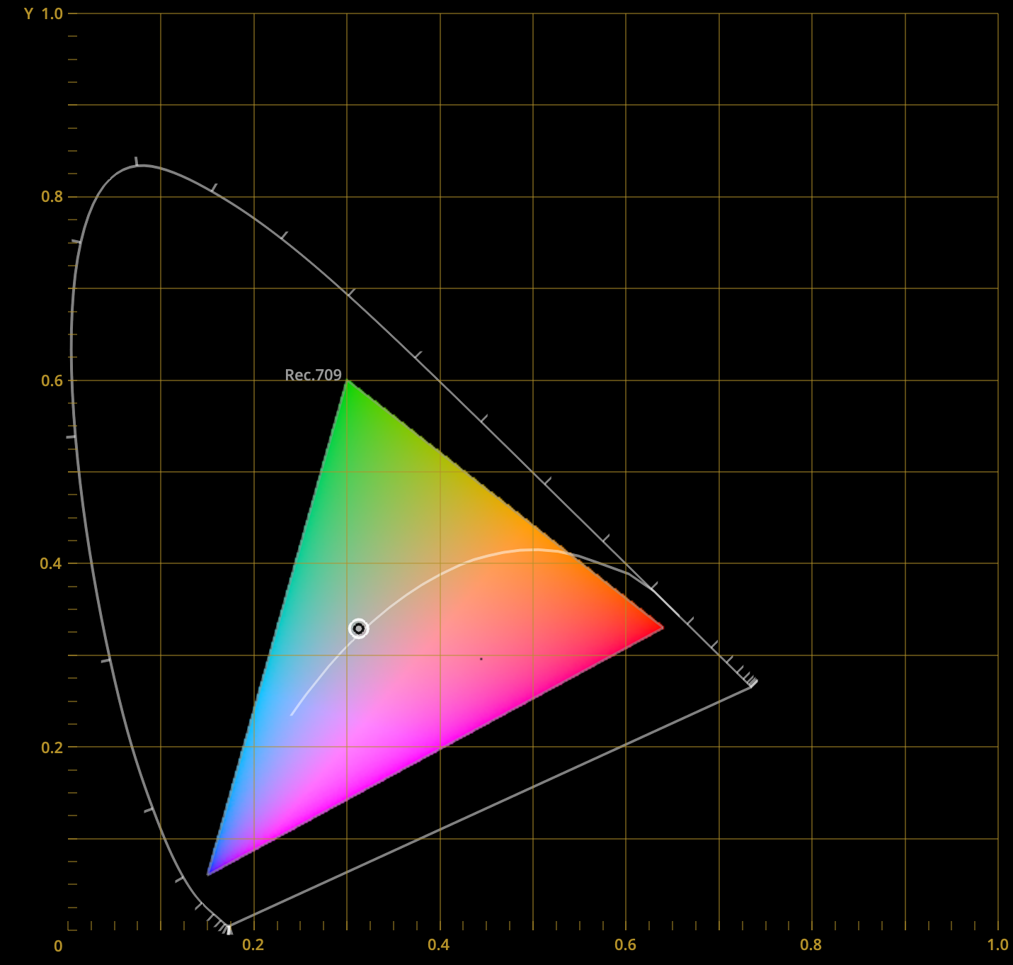
Think of this line as a horizontal axis that can solve white balance issues when a photo appears too cool or too warm. However, this alone isn't enough to fix all types of white balance problems. That's why we have the tint adjustment tool, which acts like a vertical axis. It can solve white balance issues when a photo appears too green or too magenta. Together, these two tools allow us to fix most white balance problems.
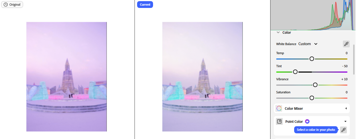
Using temperature and tint for white balance correction is quite straightforward: if the image leans blue, increase temperature to add yellow; if it leans yellow, decrease temperature to add blue; if it leans green, increase tint to add magenta; if it leans magenta, decrease tint to add green. For example, the image below has an overall magenta cast due to incorrect white balance settings, so we simply need to decrease the tint value:
Regardless of which tool we use for white balance operations, the essence is always about balancing red, green, and blue content. For instance, we can use the curves tool to increase green and neutralize magenta:
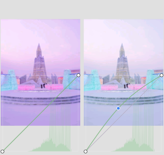
As we mentioned earlier, when there's too much magenta, we can neutralize it by adding green or by reducing magenta. So we can separately reduce red and blue content to achieve this goal (since red + blue = magenta):
So when we discuss white balance, we need to understand what we're essentially talking about.
Answering Our RGB Article's "Food for Thought"
Remember those brain teasers from our RGB fundamentals article? Here are the answers we promised:
1. If a color appears too red and we want to make it white, how can we approach this?
We have two ways to handle this: first, reduce the red, and the image will achieve white; second, enhance green and blue (which combine to create cyan), and this will also produce white. The difference is that the former reduces overall luminosity, while the latter increases overall luminosity.
2. What's the fundamental difference between white and gray?
These two colors are essentially the same—both result from balanced red, green, and blue light emission. The fundamental difference lies in their intensity; the highest intensity gray is actually white.
3. What's the fundamental difference between how displays and printed materials show colors?
Displays can emit their own light, while printed materials need to reflect light to show colors. Therefore, the former uses an additive color model, while the latter uses a subtractive color model. In other words, if a display wants to show red, we simply need it to emit red light; if we want printed material to show red, we need to apply a pigment that absorbs green and blue while reflecting red. In the additive model, more color layers mean brighter results; in the subtractive model, more pigment layers mean darker results (because more light gets absorbed).
4. Is color an objective reality or a subjective experience?
Color is fundamentally a subjective experience. We can say that light is an objective reality—the physical properties of light (such as wavelength) don't change based on different receiving subjects. However, when light with the same physical properties enters different people's eyes, the resulting color perception differs. A more vivid explanation: the same light beam entering both human and cat eyes produces completely different color sensations for each.
Challenge Yourself: Think Before You Peek!
The following questions relate to this article's extended thinking, which will help you deeply understand the knowledge points covered. I'll provide answers to these questions in the next article:
1. If a photo appears too cool, should we increase or decrease color temperature to achieve white balance?
2. Does white balance have an absolute standard?
3. If a photo has a cyan color cast, how should we process it to achieve correct white balance?
Remember this: White balance boils down to one simple truth—make RGB play fair with each other. Red dominating? Dial it back. Green playing hide and seek? Bring it forward. Every tool, every slider, every technique serves this one goal.
What's Next on Your Color Journey?
In our next deep dive, we'll explore Curves Tool and Selective Color Tool—advanced techniques that give you pixel-perfect control over every color in your images.
Ready to put theory into practice? Jump back to our Color Mixing Tool and experiment with RGB combinations in real-time!